Data visualization helps you to "tell stories" about your data; curating it into a form that is easier to understand, highlighting the trends and outliers. A good visual tells a story, removing the noise from data and highlighting useful information. Tabulate lets you choose from several different visualizations and select the one that best illustrates your data.
Adding a Visual
Select a grid of cells in the spreadsheet, and then select the appropriate visualization type using one of the following procedures.
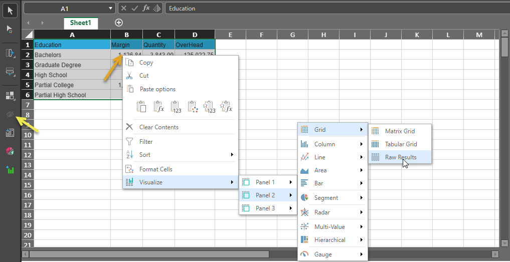
Context Menu (Panel Selection)
Important: When adding a visual using the context menu, you can directly control which panel (1-3) will house the new visualization.
With your cells, selected, right-click the selected area and choose Visualize > Panel X > <Visualization Type> in the context menu, where X is the panel that you would like to add your visualization to.
Change Visual Ribbon
From the Change Visual ribbon, select your <Visualization Type> from the relevant dropdown list.
When adding the visual using the options in the ribbon, the visual is always added into the next available panel.

When you add a visualization type following either of the preceding processes, it is opened in the current view as follows:
Visualization Types
The list of visuals and their related formatting options are a subset of those found in Discover:
- Grids are used to present data in rows and columns. You can choose from three grid types: Matrix Grid, Tabular Grid, and Raw Grid.
- Cartesian Charts plot data across two axes (a y-axis and an x-axis), which meet at 0. Includes Column, Line, Area, Bar, and Combo charts.
- Segment Charts display elements as a proportion of a whole. Includes Pie, Doughnut, Pyramid, and Funnel charts.
- Radar charts are used to plot one or more series of values across multiple quantitative variables, which are represented on axes extending from a central point. Radar charts include line charts, area charts, smooth line charts, area smooth line charts, and point charts.
- Multi-Value or Plotted Charts create multivariate Scatter and Bubble plots.
- Hierarchical Charts include Tree Maps, Hierarchical Tree Maps, Circle Packing Charts, Hierarchical Circle Packing Charts, Sankey Charts, Word Clouds, and Sunburst Charts.
- Gauges are used to display data in a KPI Gauge chart, to present the status, target, and actual values.
Manage your visuals
Change your Visualization Type
You can change the visualization type used (for example, changing a Pie Chart to a Area Chart), by right-clicking on the current visual and selecting a different visualization type from the cascading menus.
Change your visual details
You can change the name and "scope" (that is, which cells are included in your visualization) by editing its Visual details. For example, if your visualization is a Pie Chart that visualizes all values in column C in your spreadsheet you can change the range formula to include column D instead or as well.
- Click here for more details about Editing Visuals and Visual Areas in Tabulate.
Show or hide your visuals
If you have visualized data in your tabulation, you can show and hide those visualizations in the current view:
- If you are a Tabulate Pro user, you can use the Show Visual and Hide Visual buttons in the Toolbox (yellow arrow above) to show or hide all of your visualizations. This option is only enabled in the Toolbox where visualizations have been created for the tabulation.
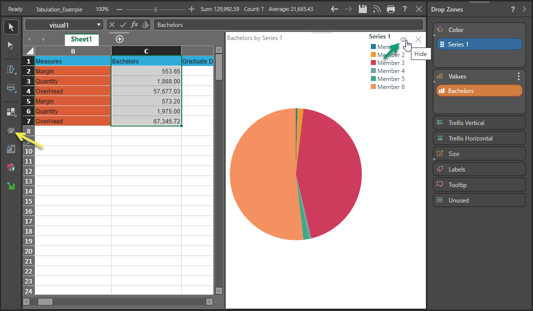
- If you are a Tabulate Pro or Tabulate Lite user, you can use the button at the top-right of each individual visual panel (green arrow) to hide a single visualization.
Drop Zones
The Drop Zones panel is only shown where some of all of the tabulation has been visualized and where you have the visual that you are interested in selected.
- Click here for more information about Drop Zones in Tabulate
Other topics
For a comprehensive review of visuals and how to build them, you might want to see the following topics in the main Discover help: